Relab

Apparel graphics, visual systems, and brand communication
From 2024 to 2025, I worked as a Creative Graphic Designer for RELAB, developing graphic designs for the brand's successive collections and product launches. My work focused primarily on apparel graphics but eventually expanded to include campaigns, packaging, and digital assets.
- Role
- Creative Graphic Designer
- Team
- Creative Director, Fashion Designer
- Timeline
- 01.2024–09.2025
01 · INTRODUCTION
Projects for RELAB were developed both based on specific creative directions and with greater design freedom. Depending on the collection, I either developed the provided guidelines or proposed my own concepts, overseeing the graphic design process from the initial directions and visual experiments through to the final preparation for production. As our collaboration evolved, individual projects began to extend beyond apparel. Graphic elements and typography were developed across products, packaging, and digital communications, creating a cohesive visual language for individual launches and collections.
02 · SELECTED APPAREL PRINTS
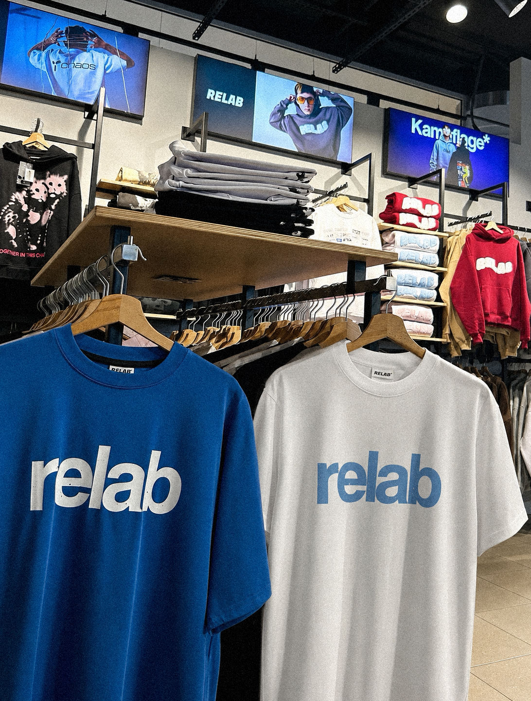
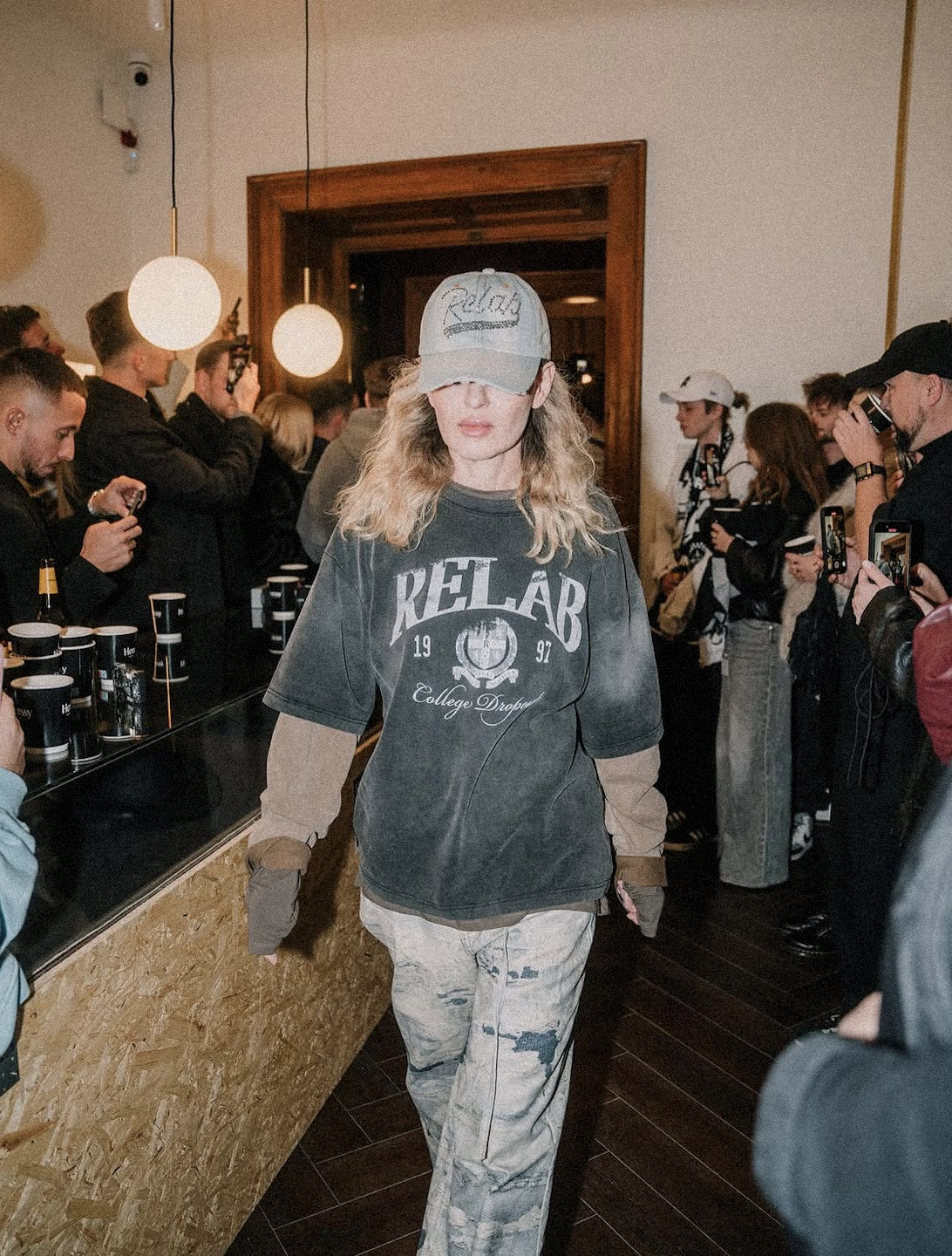
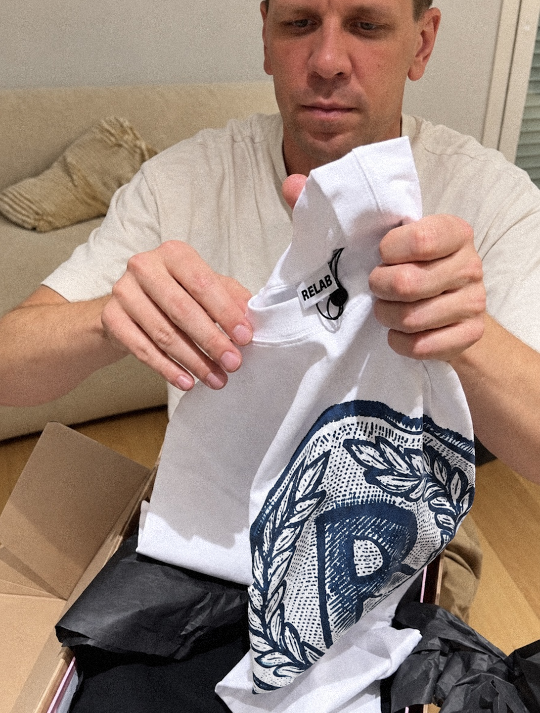
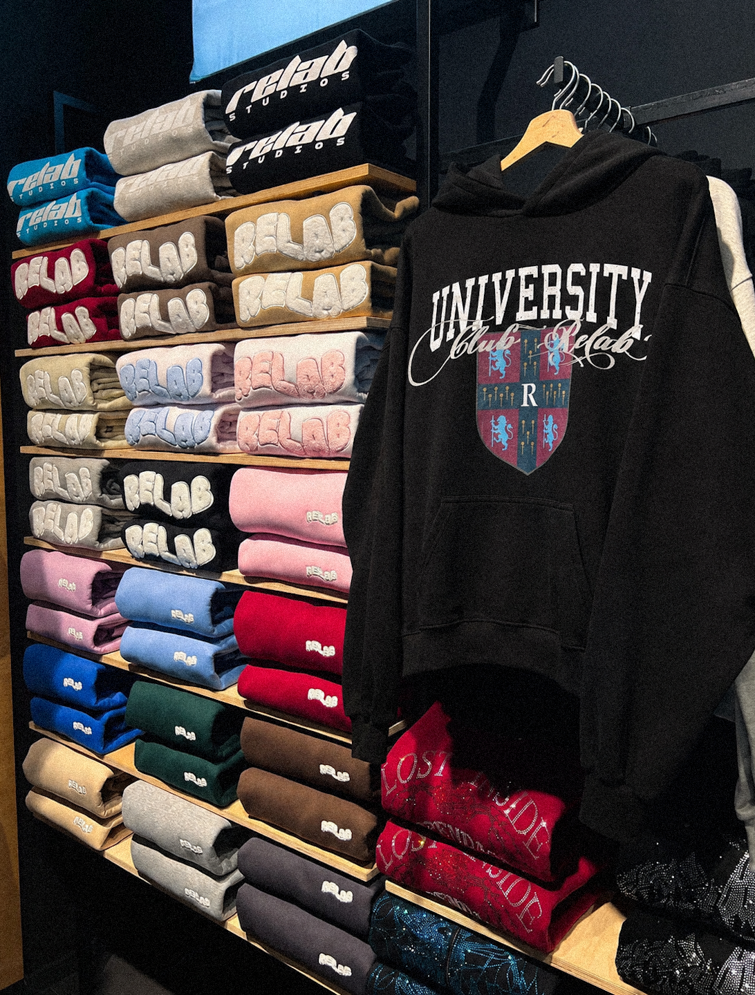
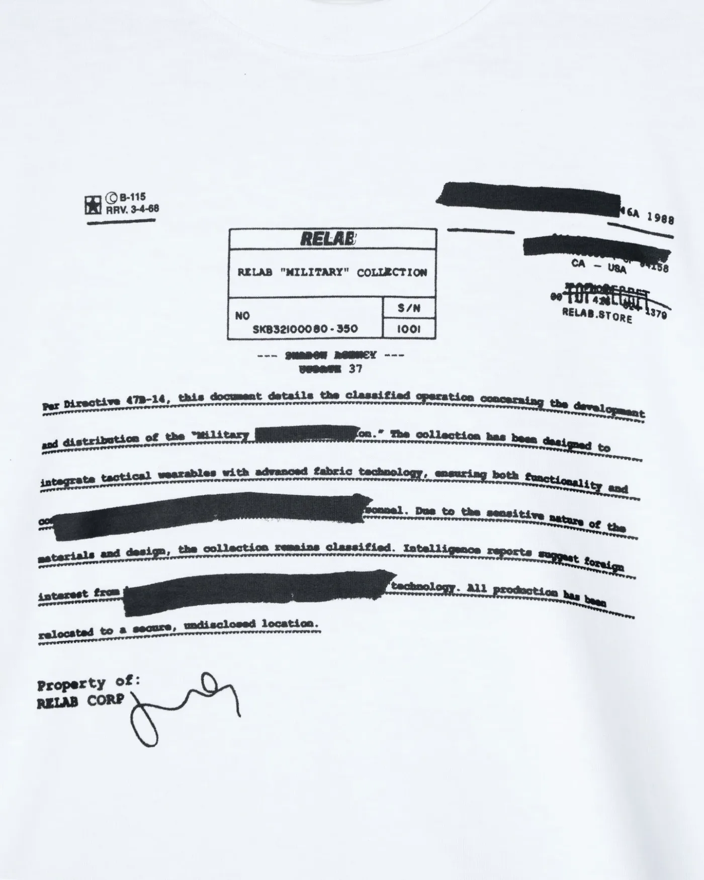
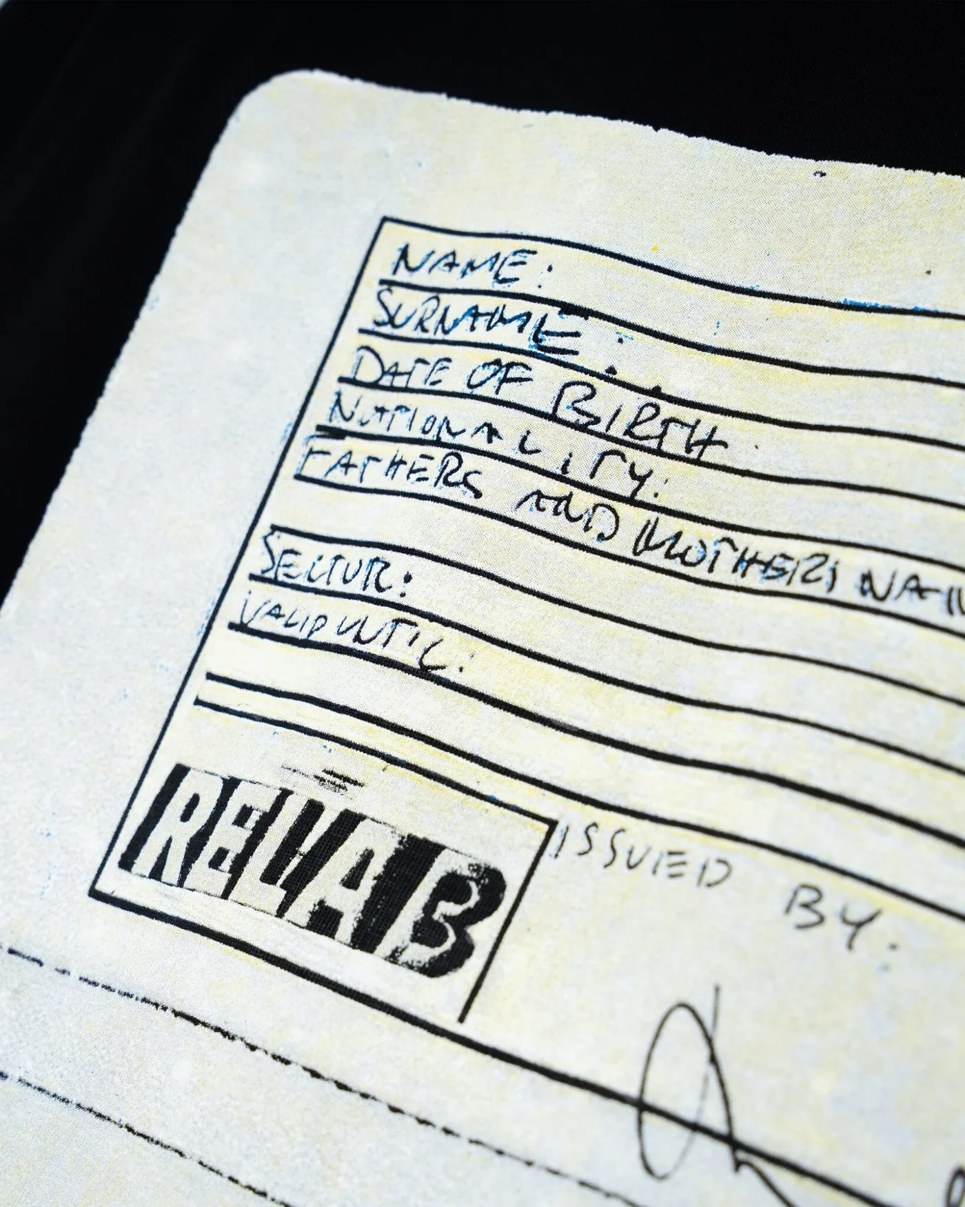
Selected designs created for RELAB and implemented on final products. The scope included graphic designs developed for various clothing styles, ranging from individual designs to broader graphic systems, each tailored to the nature of a specific product and the visual direction of a given collection.
Selected projects created for Relab (2024–2025)
03 · GRAPHIC DESIGN
Selected examples illustrating how to develop graphic motifs, work with form, typography, imagery, and texture, the final design of the graphics, and their application on clothing and other formats.
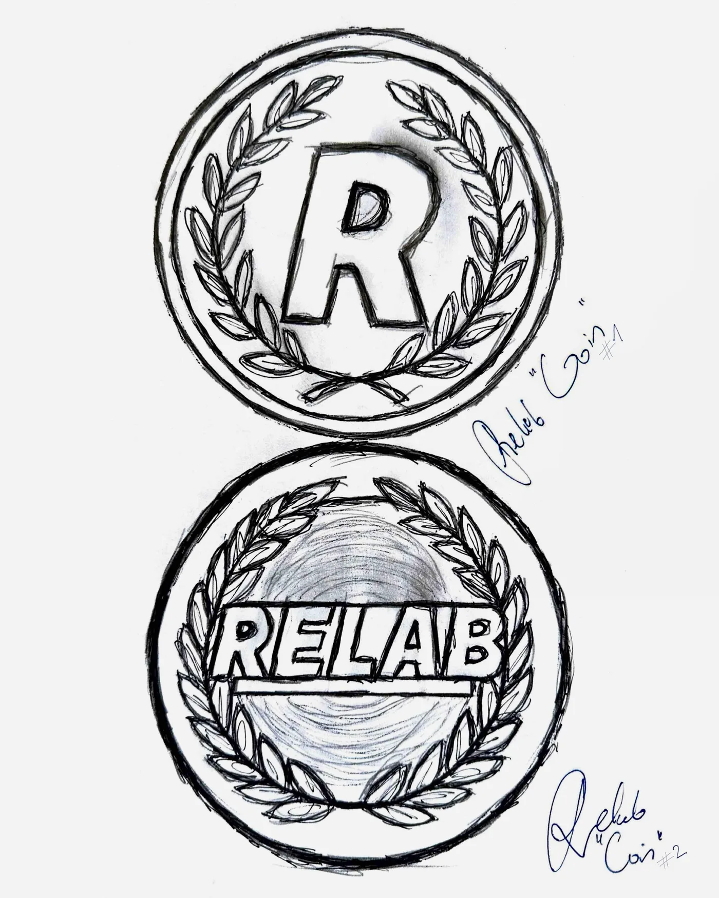
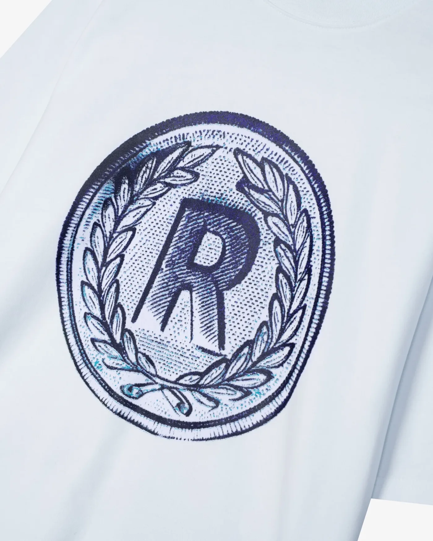
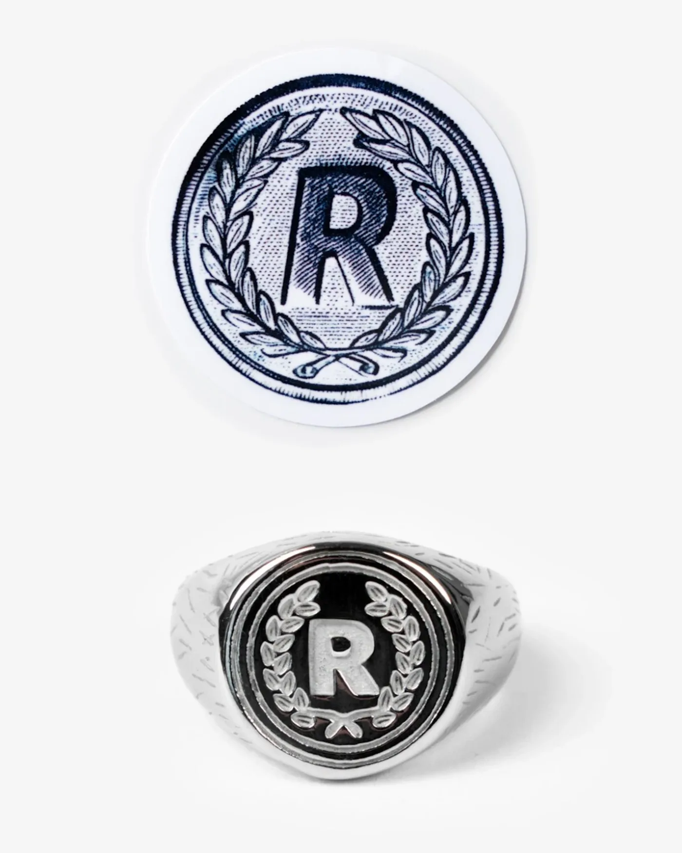
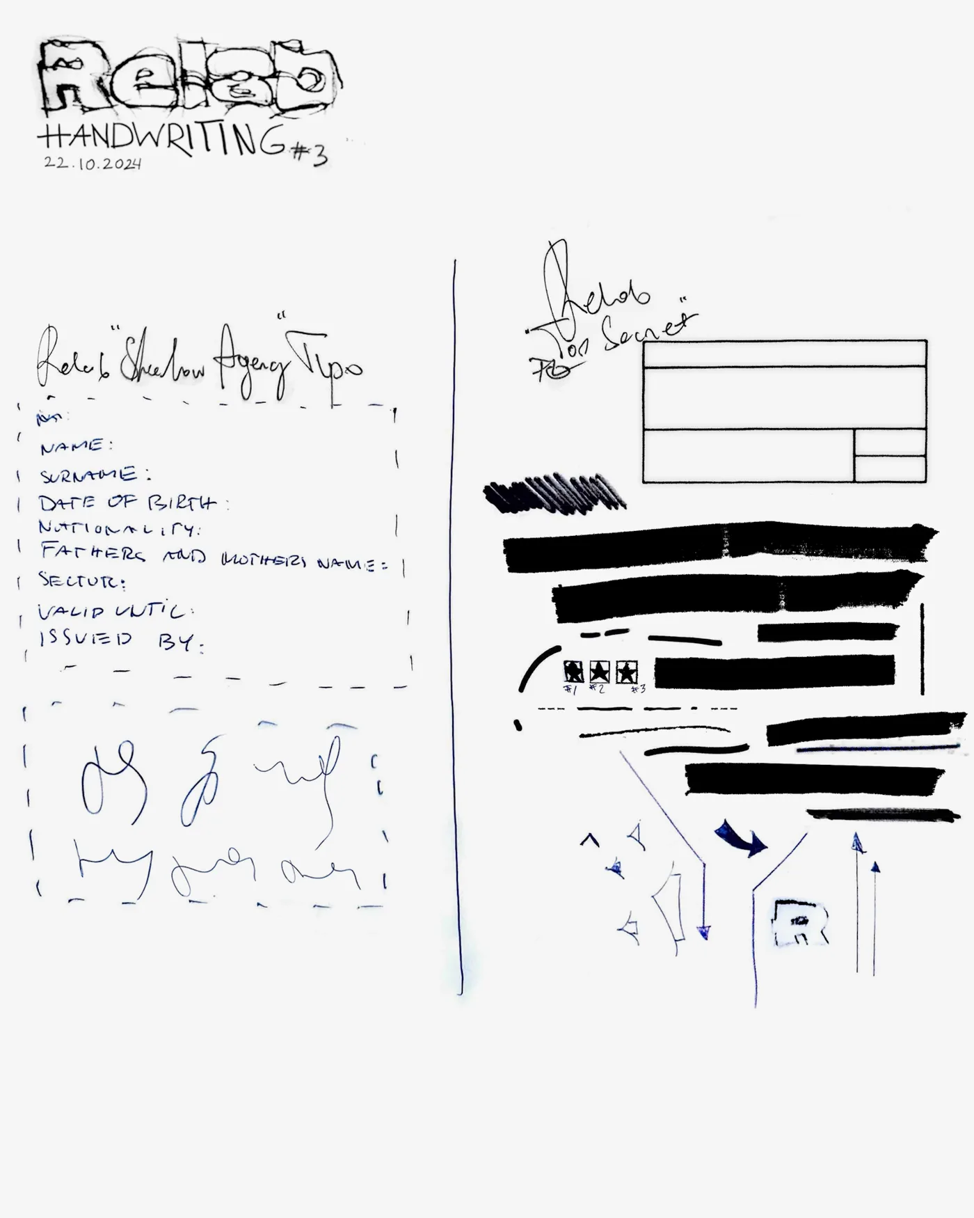
02.1 · FEATURED DESIGN PROCESS - "SUN HOODIE"
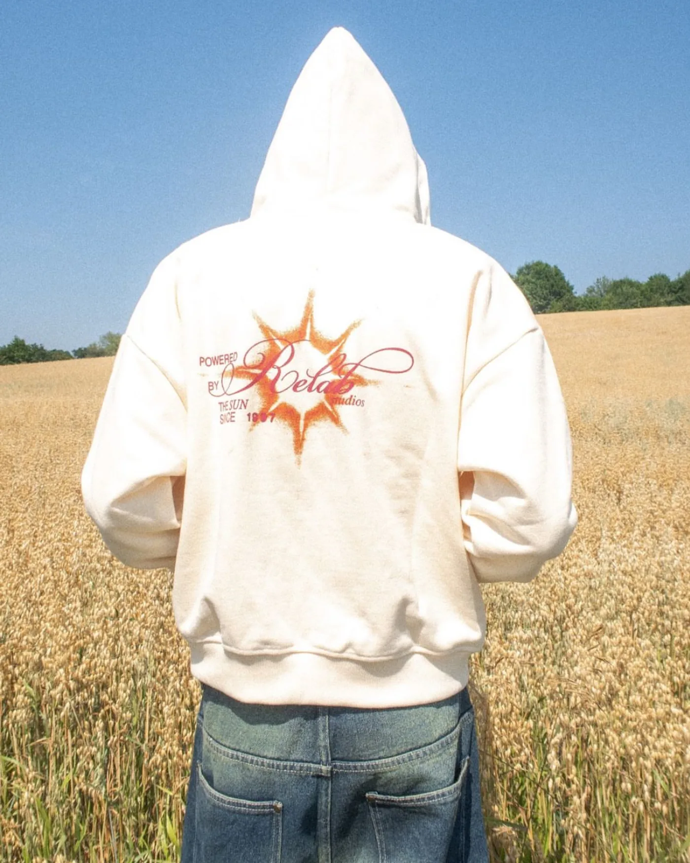
The project began with a brief centered on a sun motif, combining an aged, vintage look with a more contemporary, futuristic style. In addition to developing the specified direction, I was given the opportunity to propose my own design. I prepared both options, and my original concept was selected for further development and final production.
> VISUAL DESIGN
Selected examples illustrating the visual language of the brief, solar motifs, weathered surfaces, pixelation effects, and the contrast between vintage aesthetics and more contemporary forms.
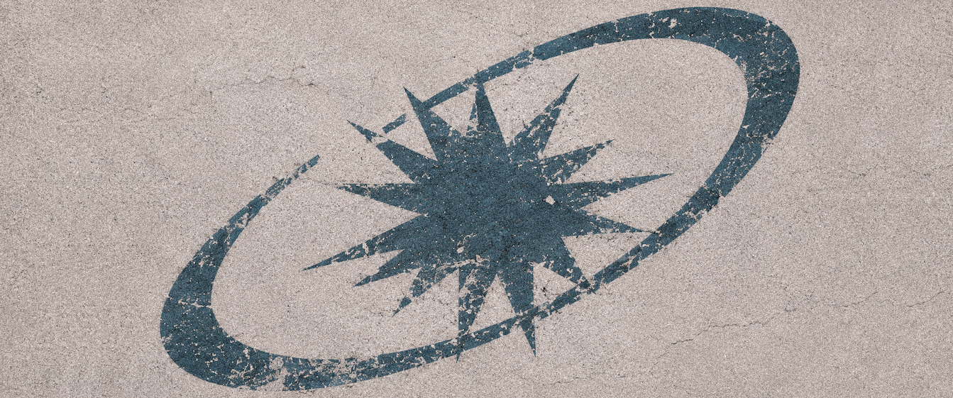


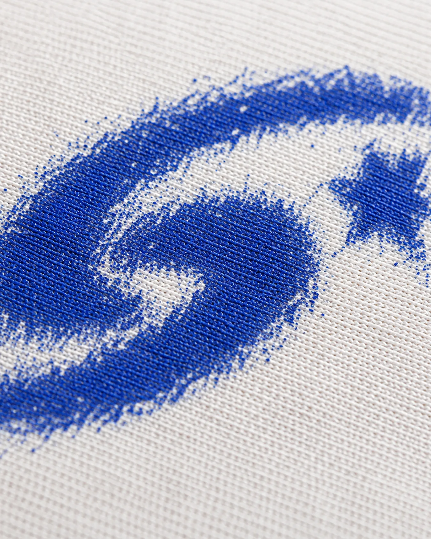
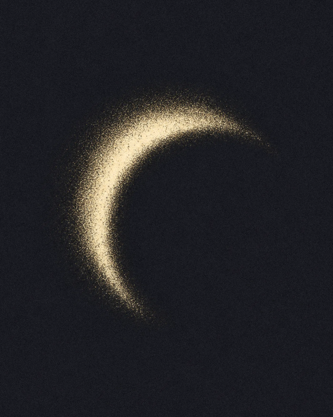

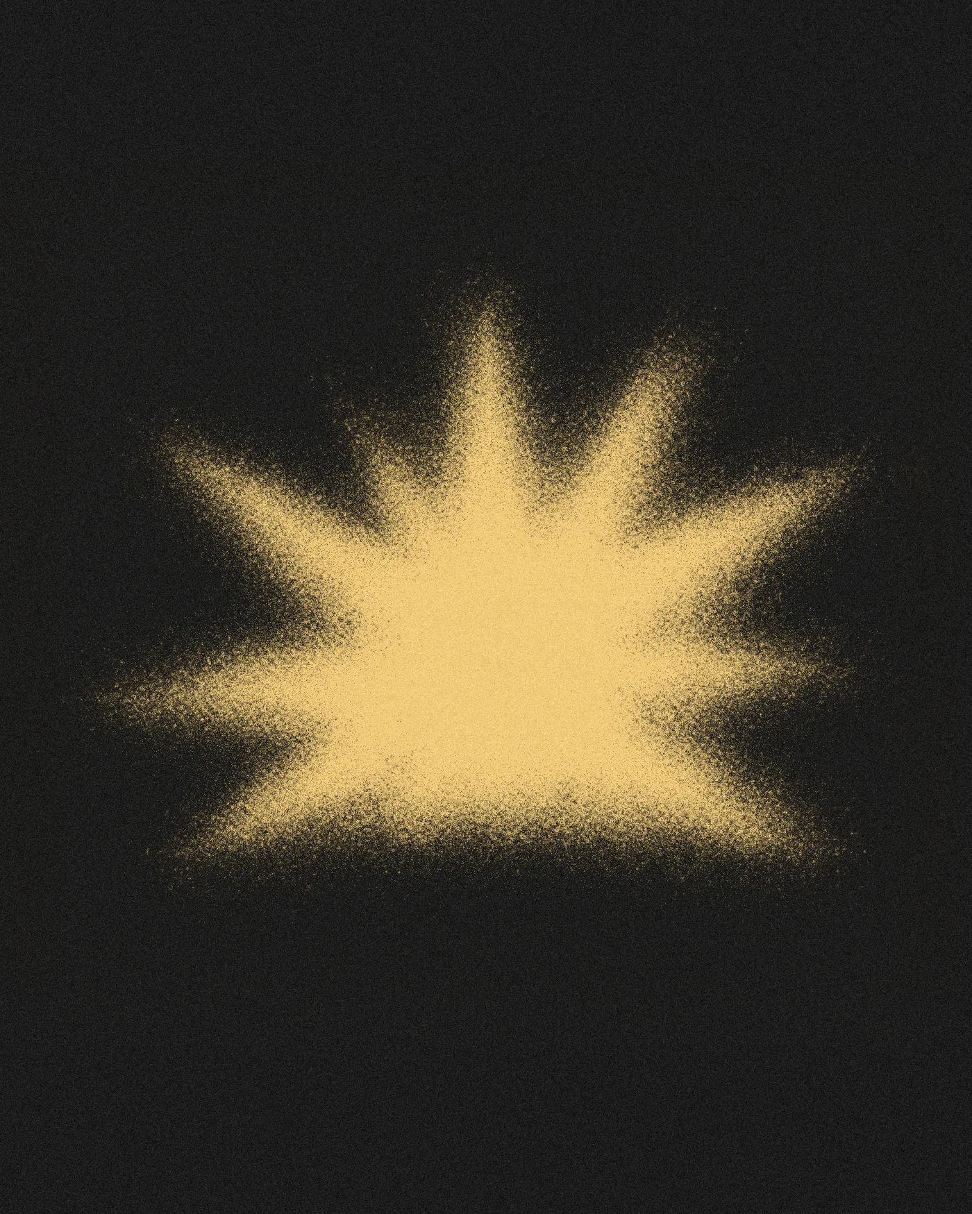
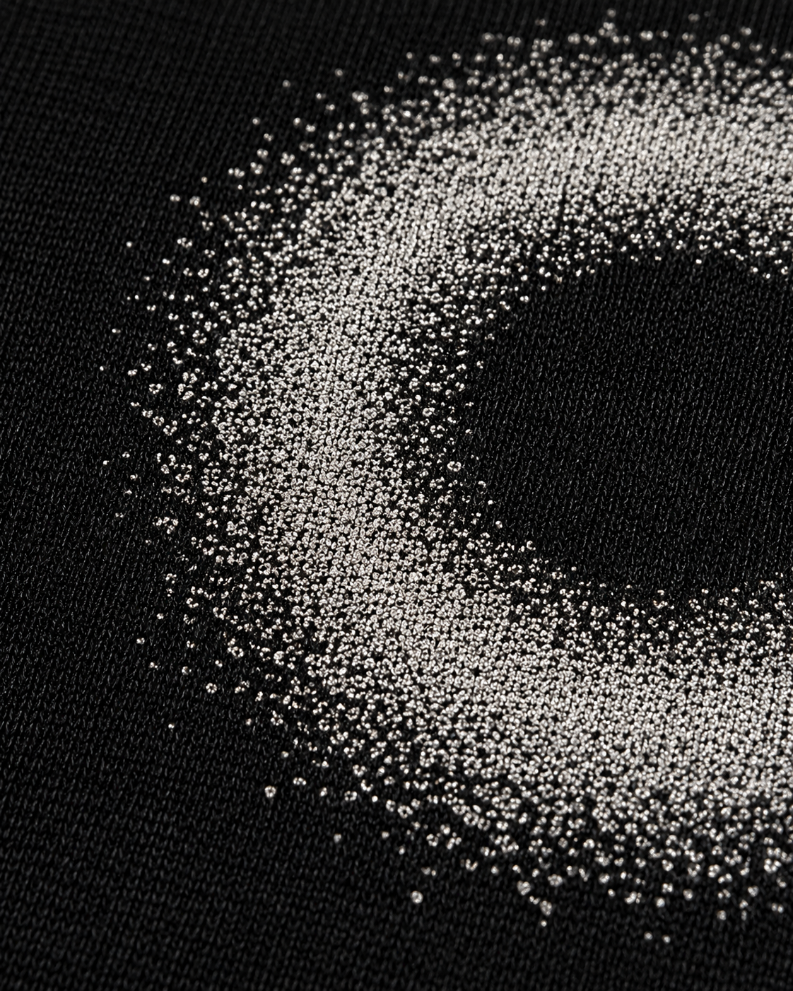
A visual interpretation of the key points from the brief I received as a starting point for the SUN HOODIE project. This material was prepared for my portfolio without disclosing the brand’s original internal materials.
> TWO DESIGN APPROACHES
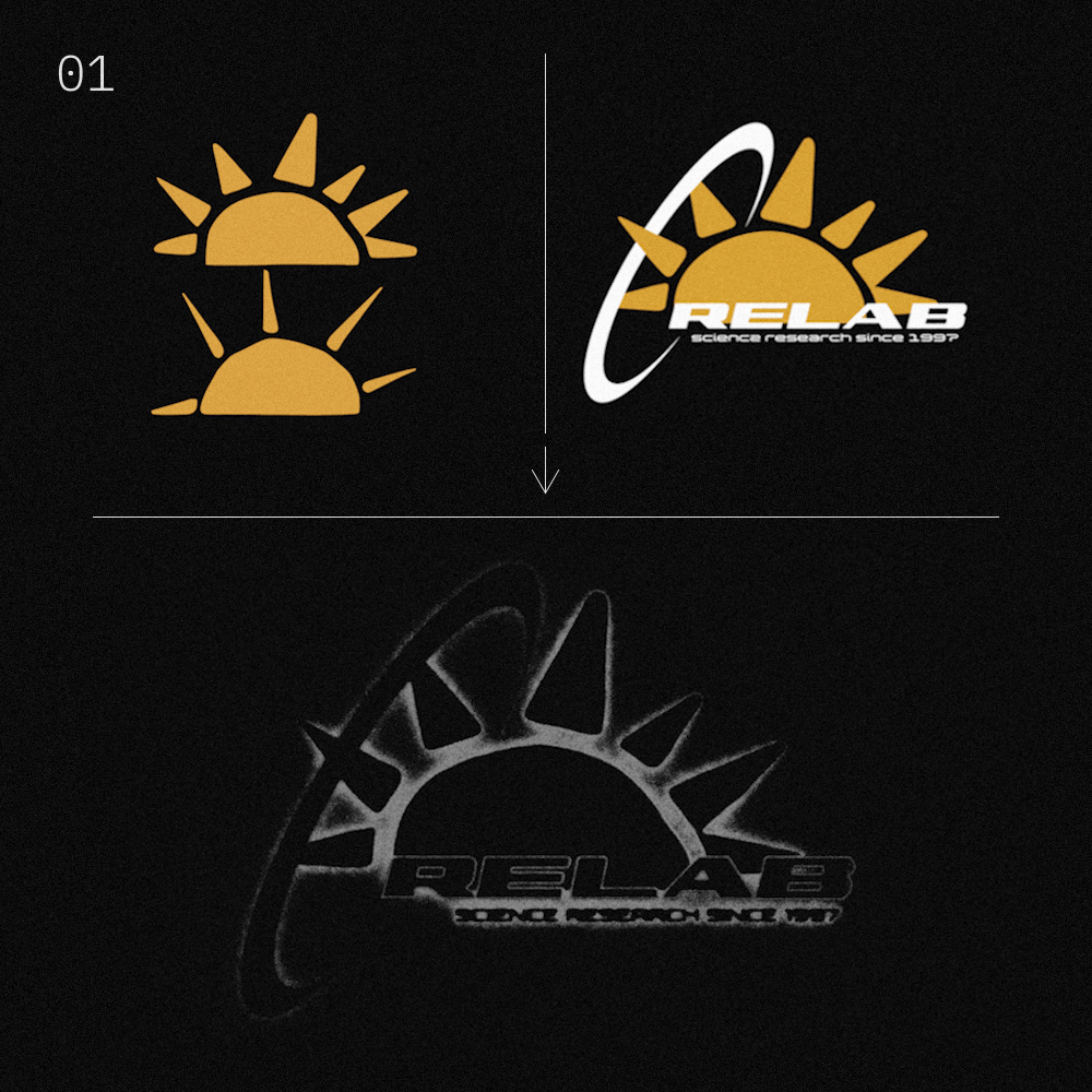
I developed two solutions in parallel: the first directly addressed the brief’s requirements, and the second was an original approach that represented my interpretation of its main principles. The brand chose the second concept for further development.
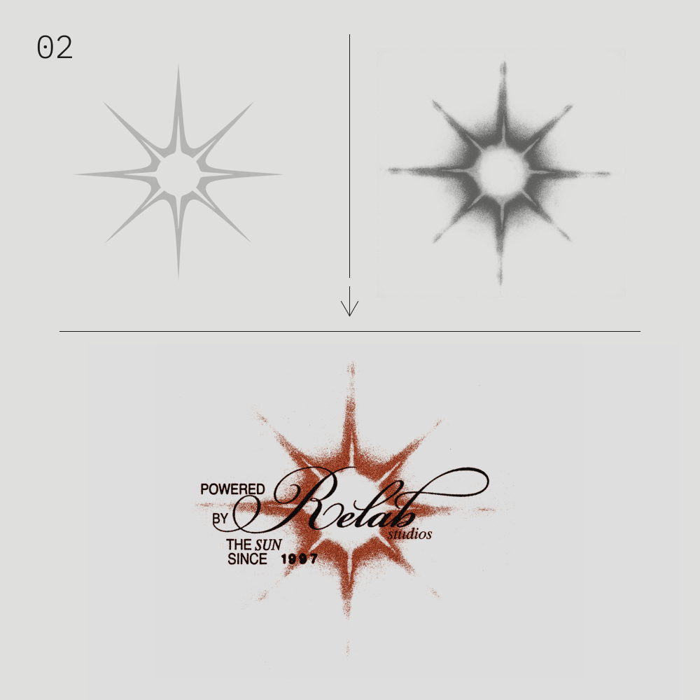
> DEVELOPMENT OF A SELECTED FORM
The initial geometric form was gradually transformed through freehand and raster-based experiments. Subsequent iterations resulted in a less regular appearance and led to the development of the asset used in the final composition.

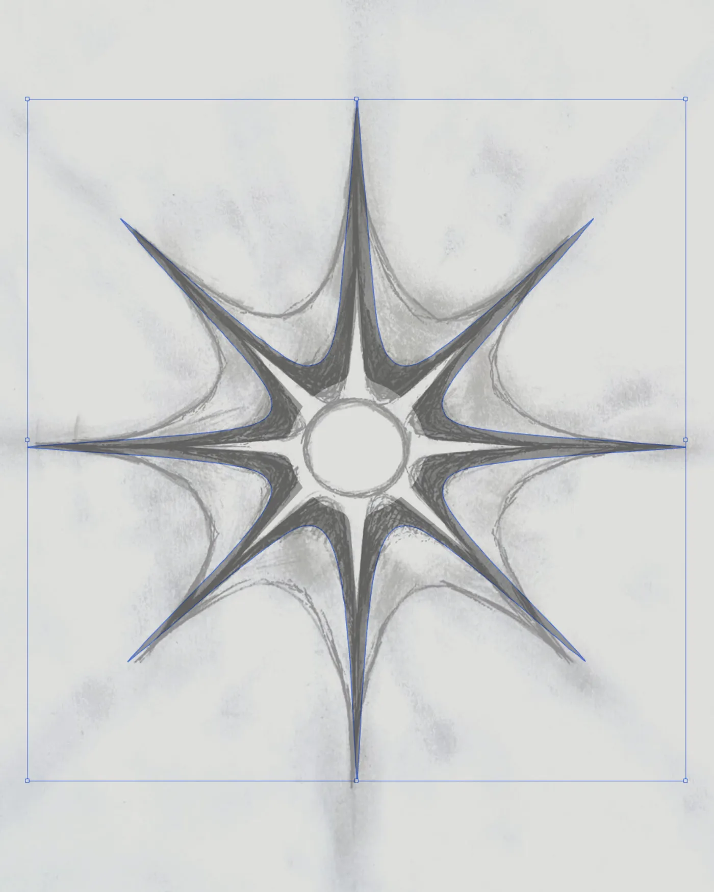
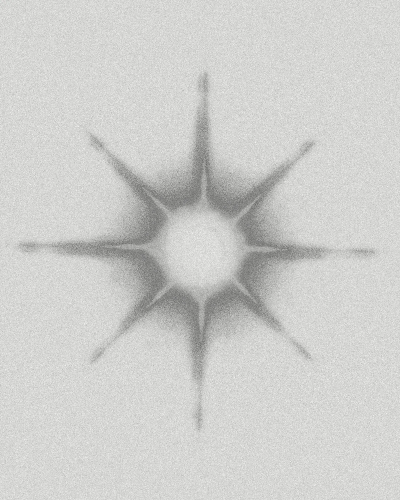
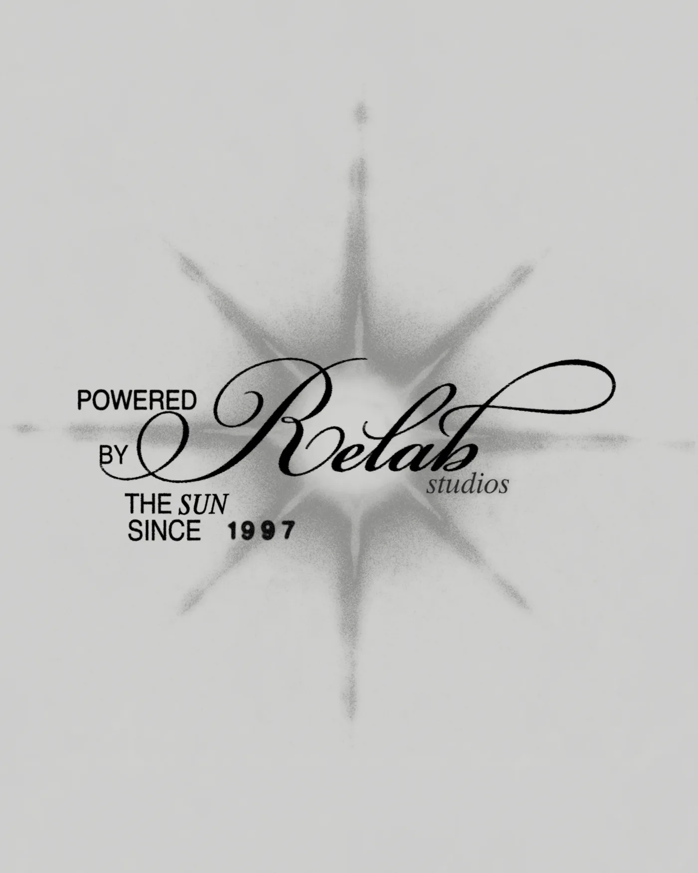
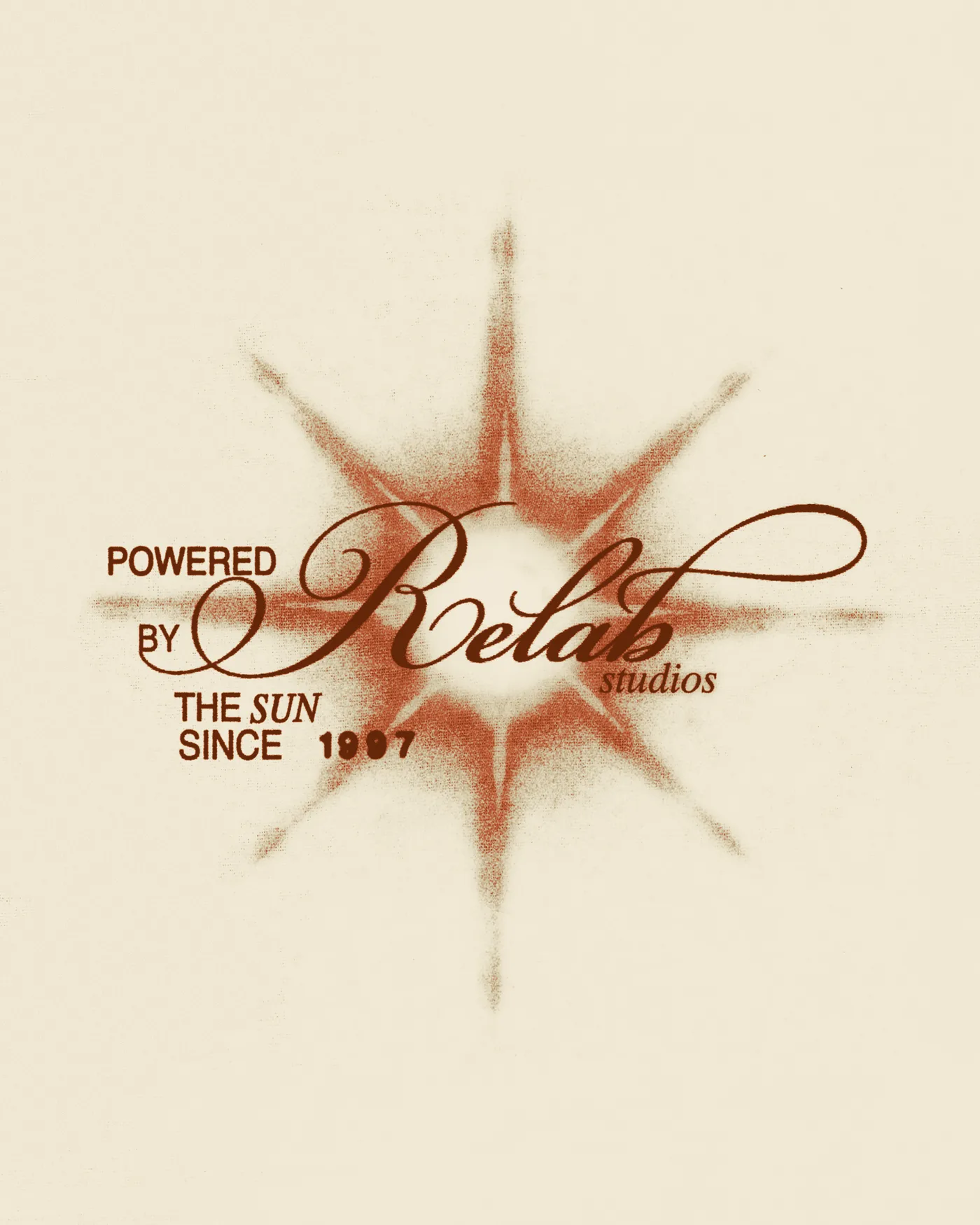
The process of developing a basic vector form through freehand and raster experiments, and then combining it with typography, color, and surface effects to create the final graphic.
> FINAL COMPOSITION
The selected theme, combined with typography, color, and layered surface effects, is transformed into the final graphic design prepared for use on apparel.
03 · PRINTING, SURFACE, AND APPLICATION
Graphics designed with the target marking techniques and their subsequent application to the product in mind. A key aspect of the work was the digital creation of realistic aging and cracking effects directly within the graphic design, allowing the character of the worn print to be defined even before the production stage. Individual projects utilized various marking techniques, sometimes combined within a single product—for example, by complementing a DTG print with embroidered elements.
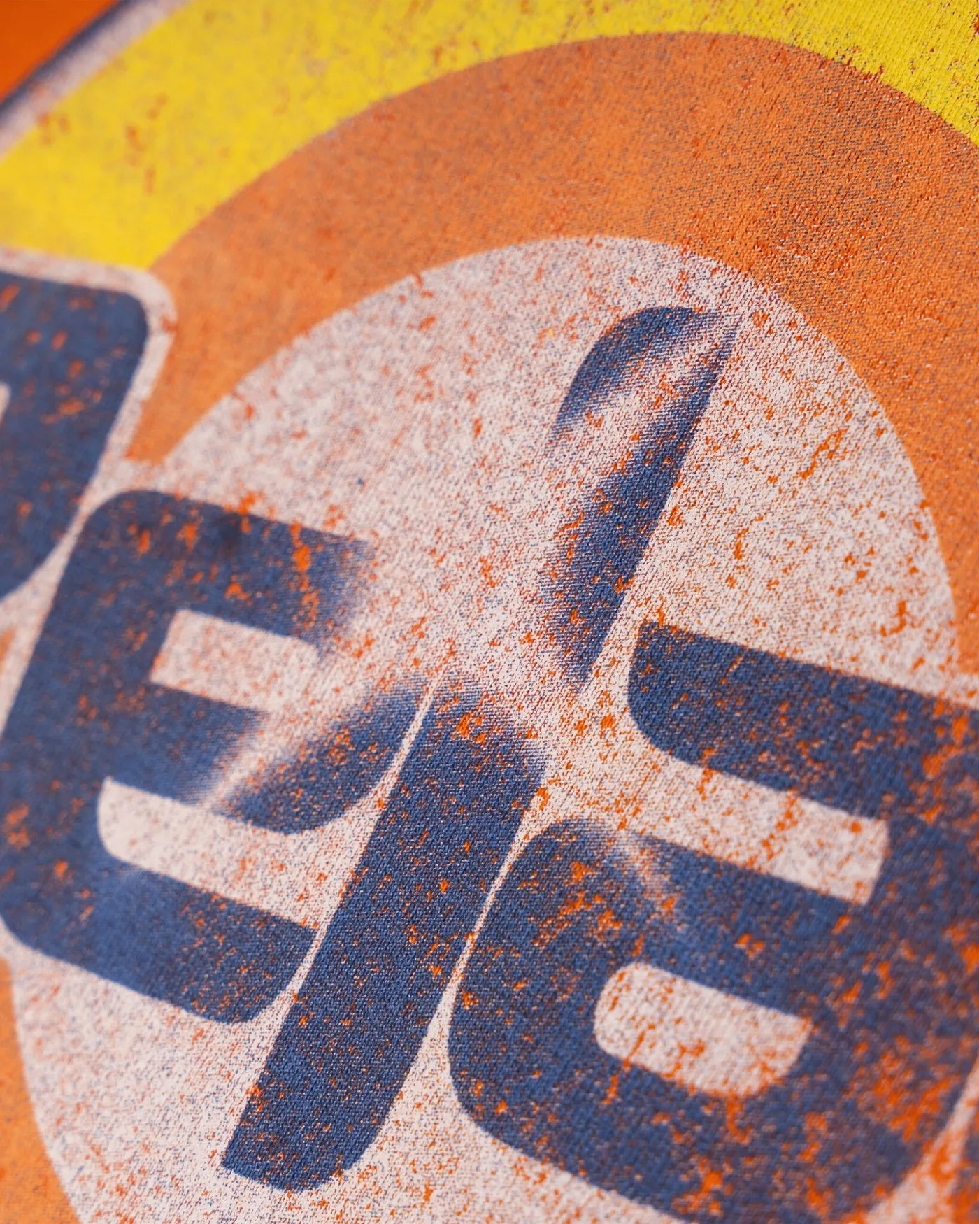
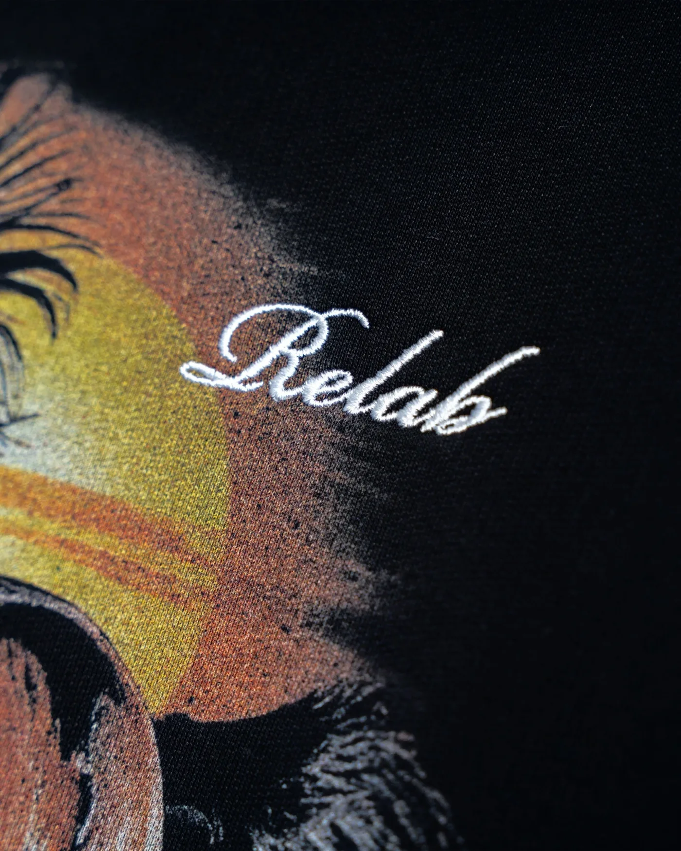
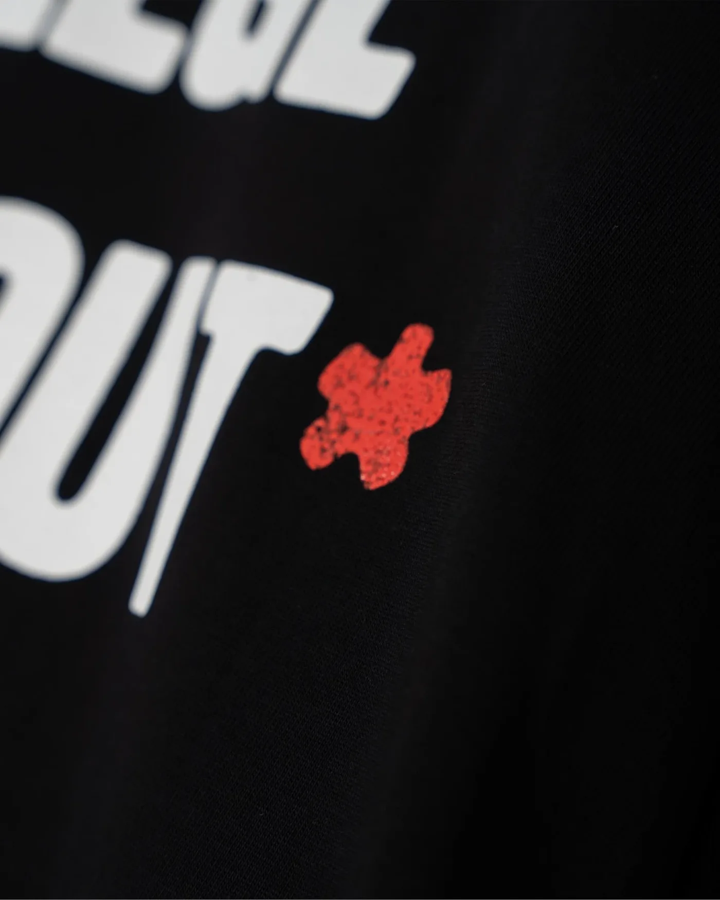
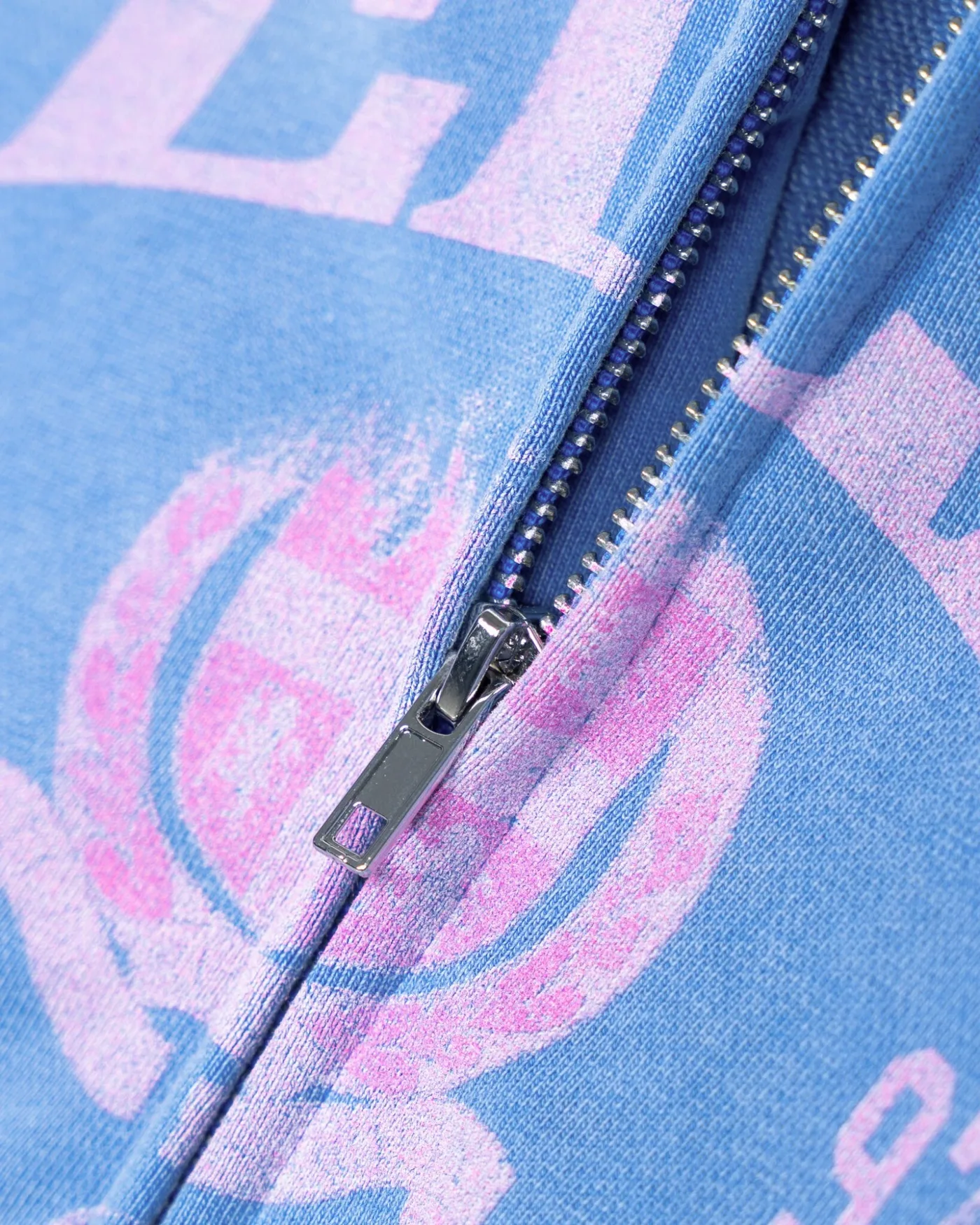
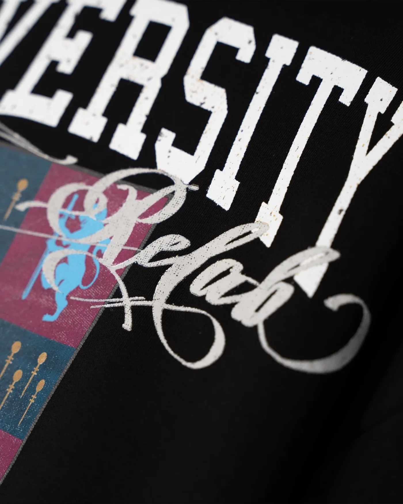
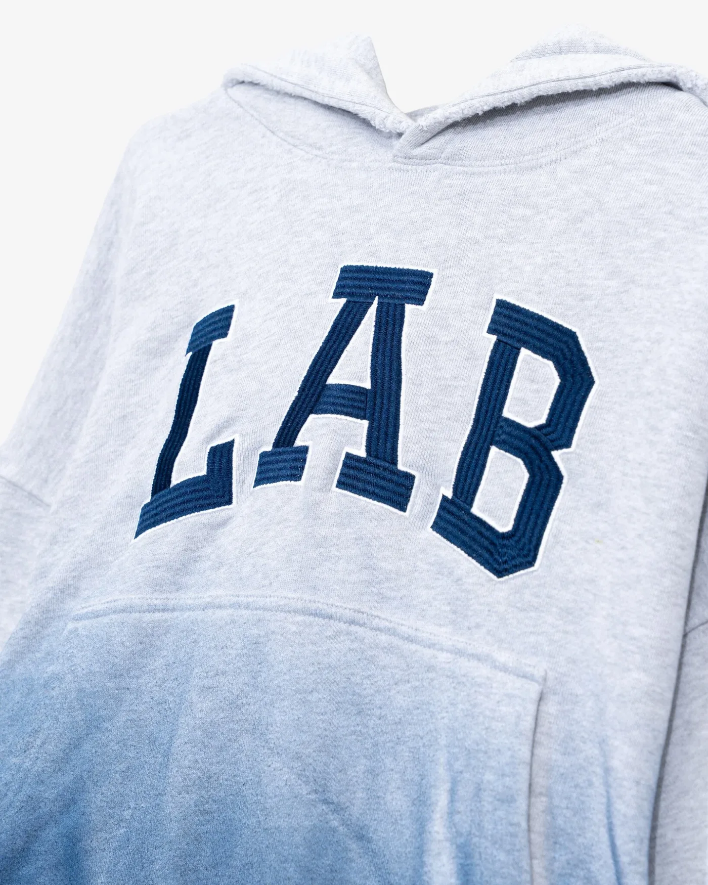
Selected details from completed projects showcasing various marking techniques, how they are combined, and how the graphics appear on the finished product.
Craft & Execution
The production phase involving the translation of the chosen direction into refined, production-ready visual elements across all final materials.
> RELAB LAUNDRY
The visual direction of RELAB LAUNDRY drew inspiration from the vintage aesthetics of laundry detergent packaging and the distinctive graphic language of old consumer products. Custom typography, a vibrant color palette, and aging and cracking effects created a distinctive visual language, which was then applied to apparel and other project materials.
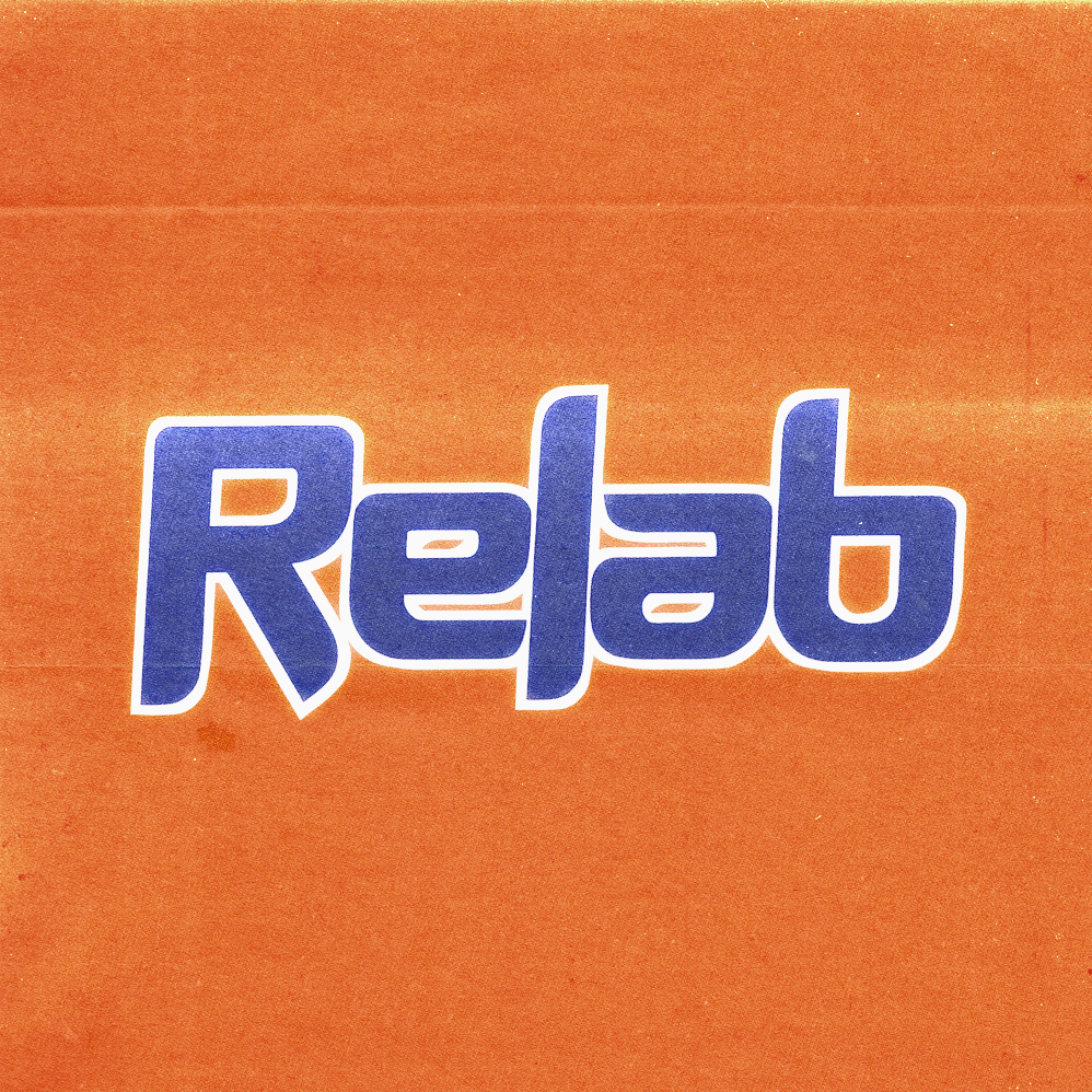
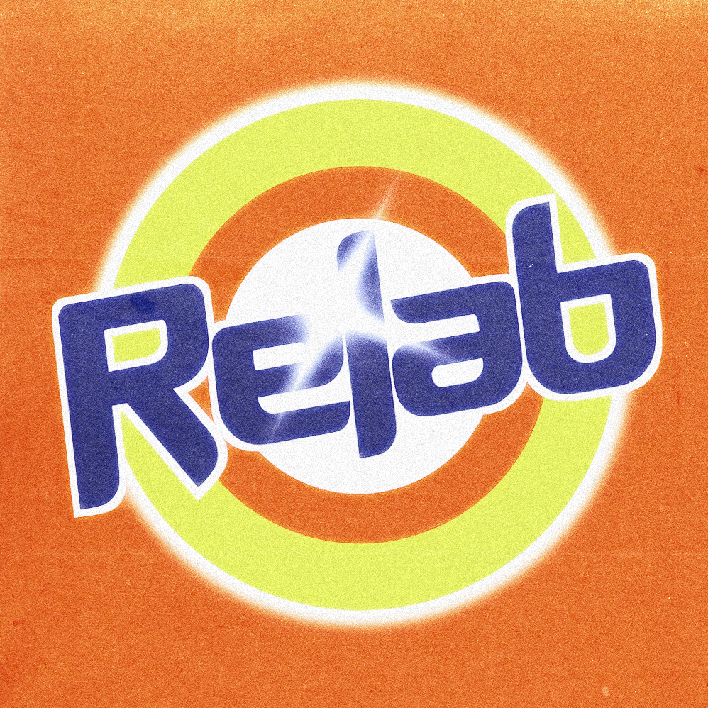
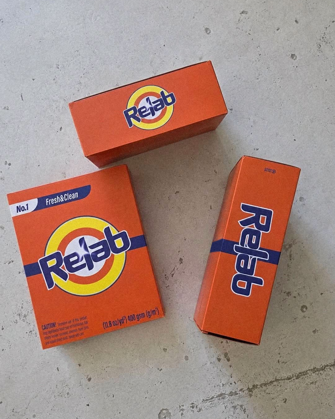
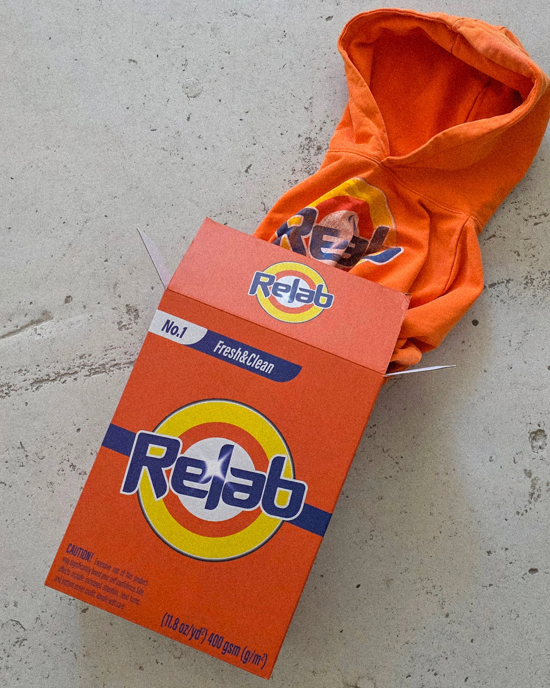
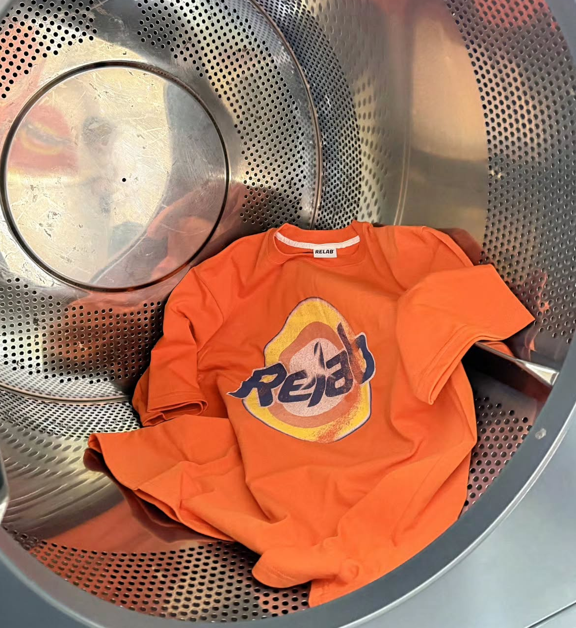
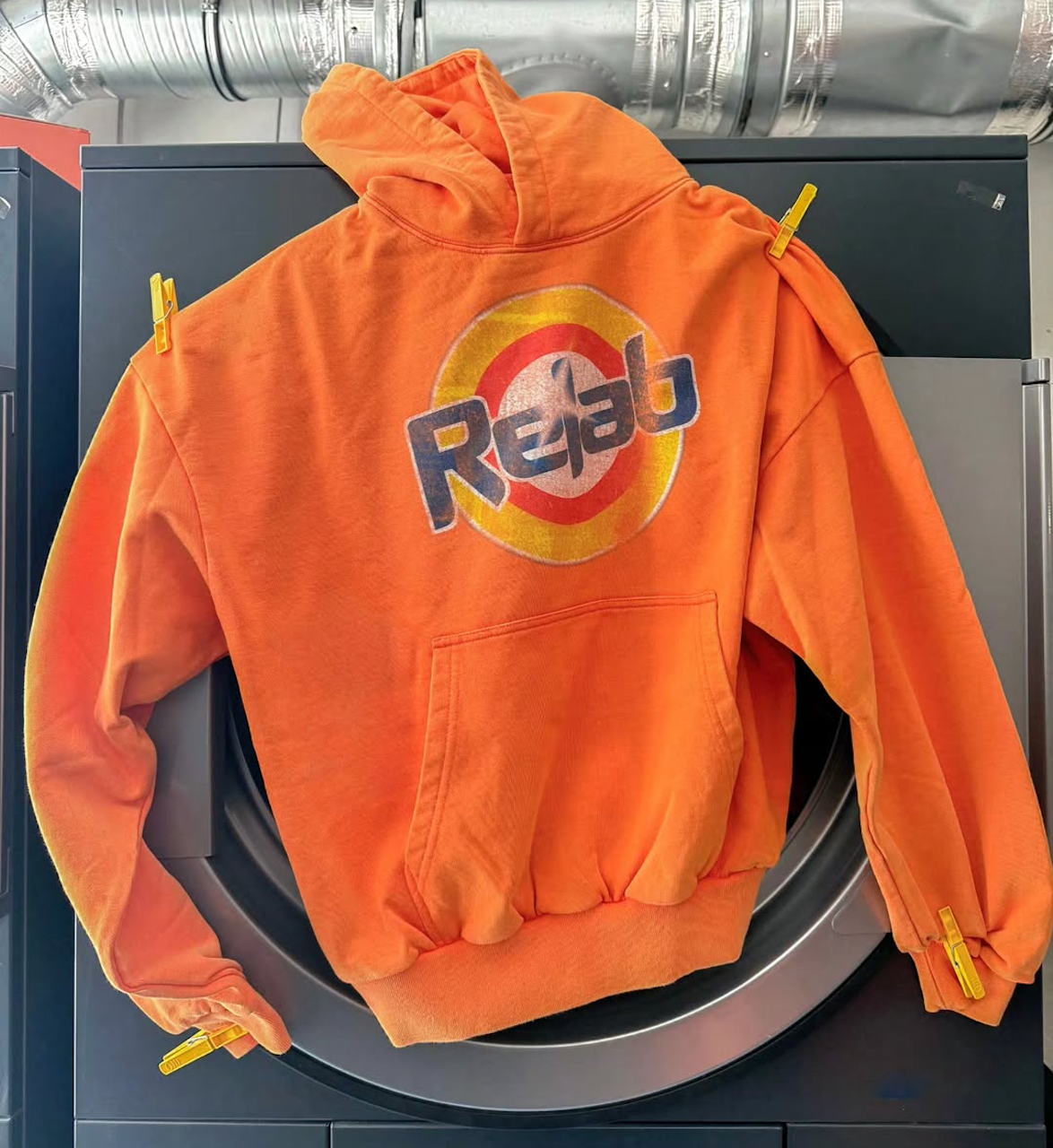
The logo and typography I designed formed the basis of RELAB LAUNDRY’s visual language, appearing on clothing and subsequently adapted by the team for packaging and other project materials.
> RELAB LAB
The LAB project drew inspiration from the aesthetics of American college apparel, translated into the brand’s more minimalist style. The central element of the project was the custom-designed LAB lettering, which was featured on the apparel and in the launch communications.
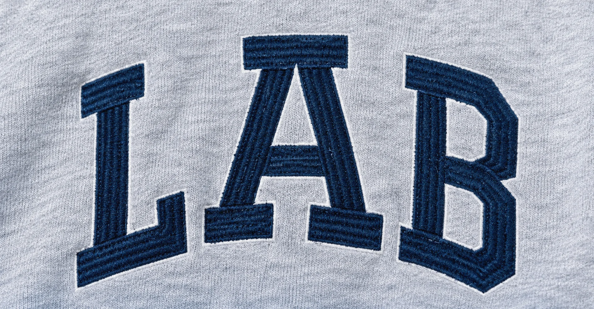
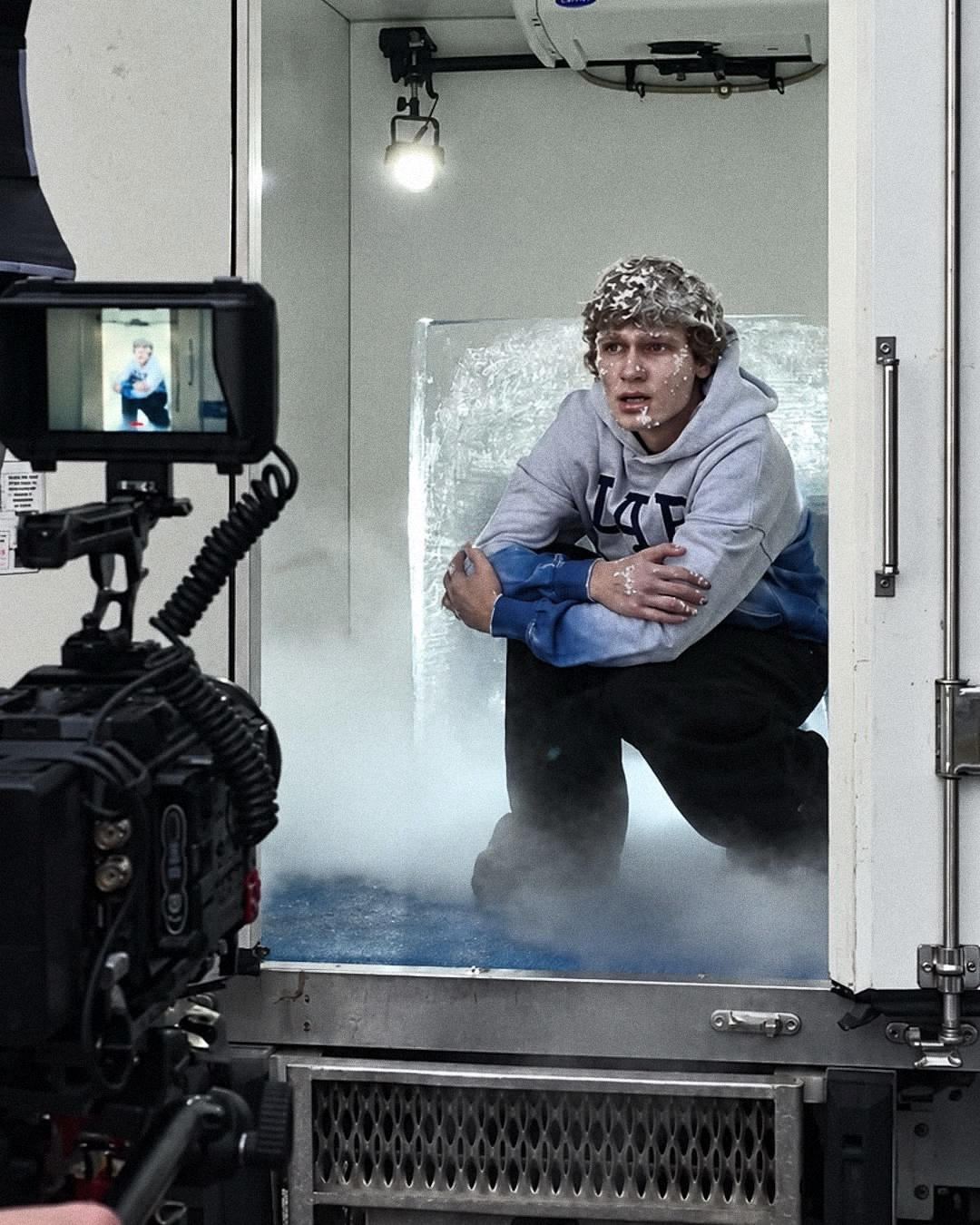
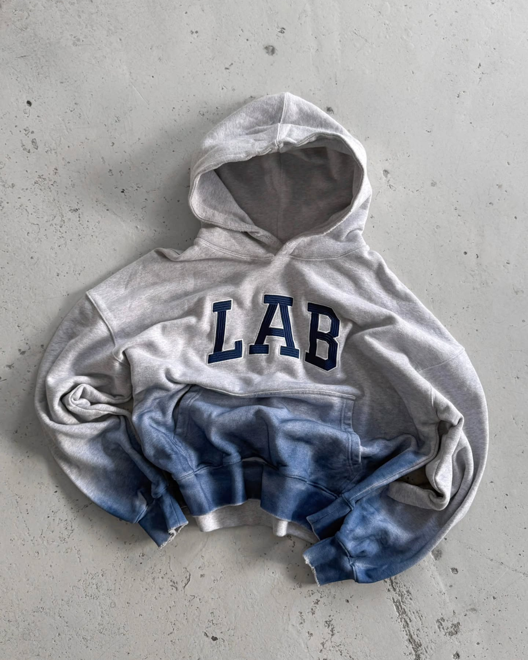
A LAB sweatshirt featuring custom lettering, shown in its final product form and in promotional materials for the launch.
RELAB Moments Saver
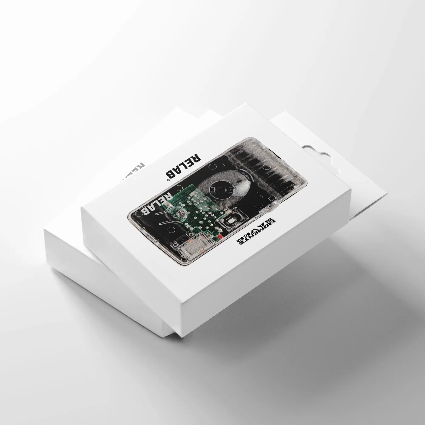
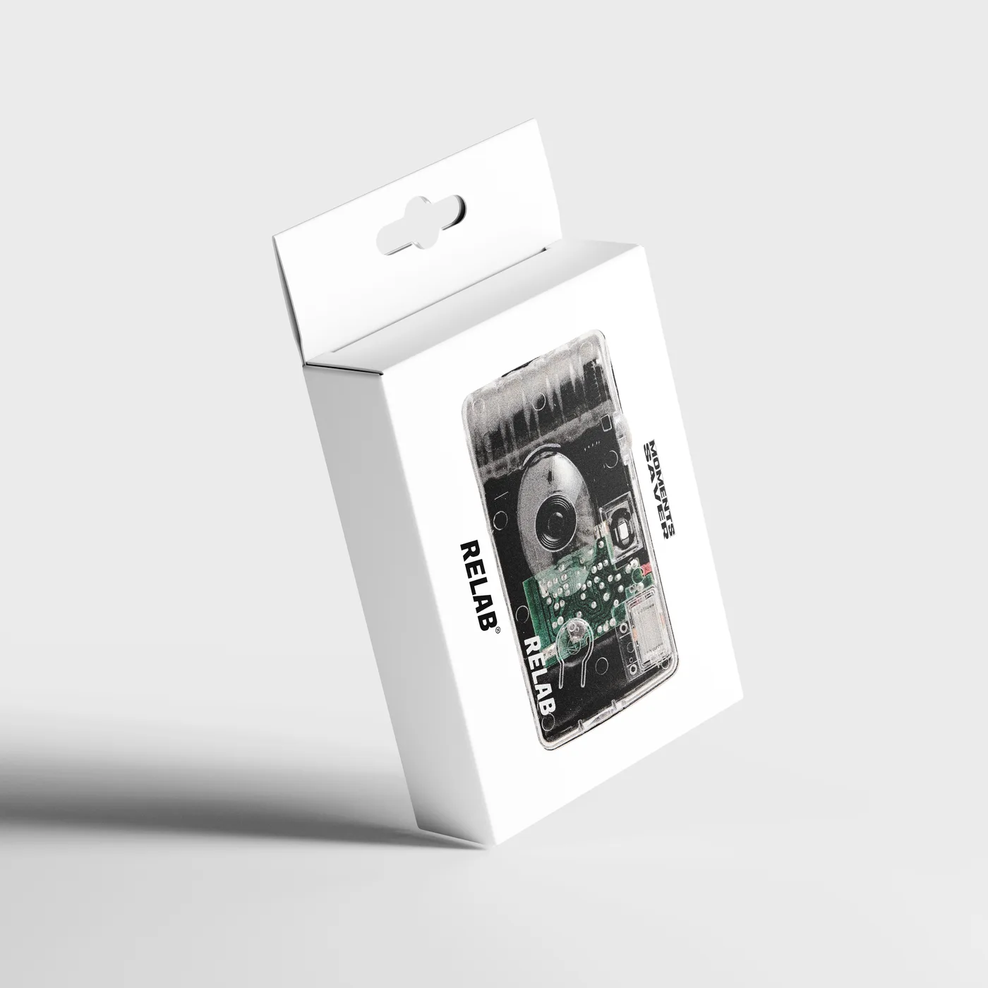
A campaign and packaging concept developed in-house to mark the launch of a custom disposable camera. The project combined product packaging, visual storytelling, and campaign management into a cohesive brand experience inspired by nostalgic photographic culture and contemporary streetwear aesthetics, in line with the brand’s visual identity.
> PACKAGING AND PRODUCT INFORMATION SYSTEM
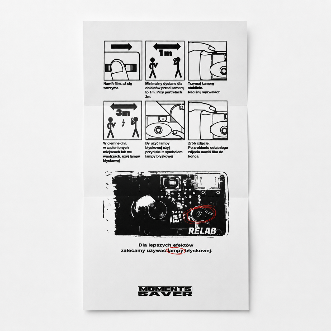
A packaging system developed based on the provided production template, combining a custom visual design with product and functional information.
> PRODUCT CAMPAIGN PROJECT
A campaign design that builds on the Moments Saver brand identity, inspired by archival camera advertisements from the 1970s and 1980s, combining product photography, typography, and elements from the previously developed graphic system.
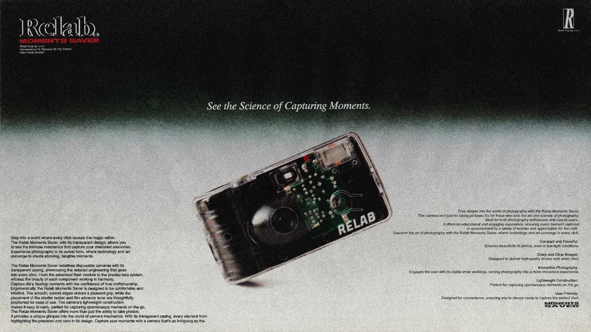
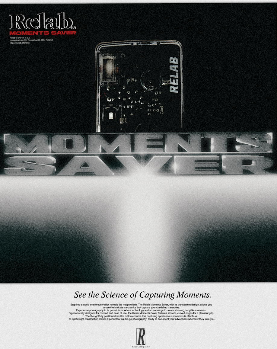
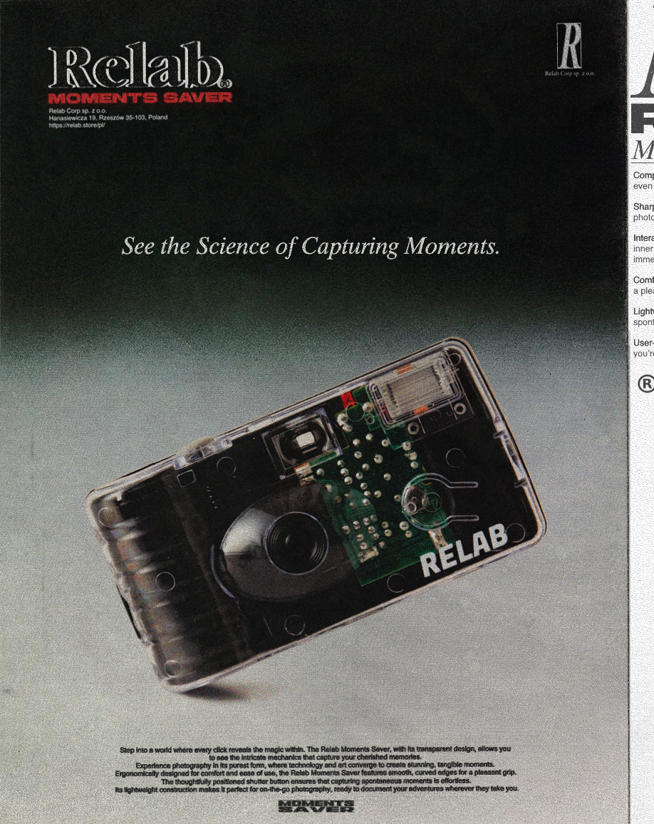
Additional visual materials that expand on the theme of the Moments Saver campaign, created for use in social media and digital channels.
Digital Content and Campaign Materials
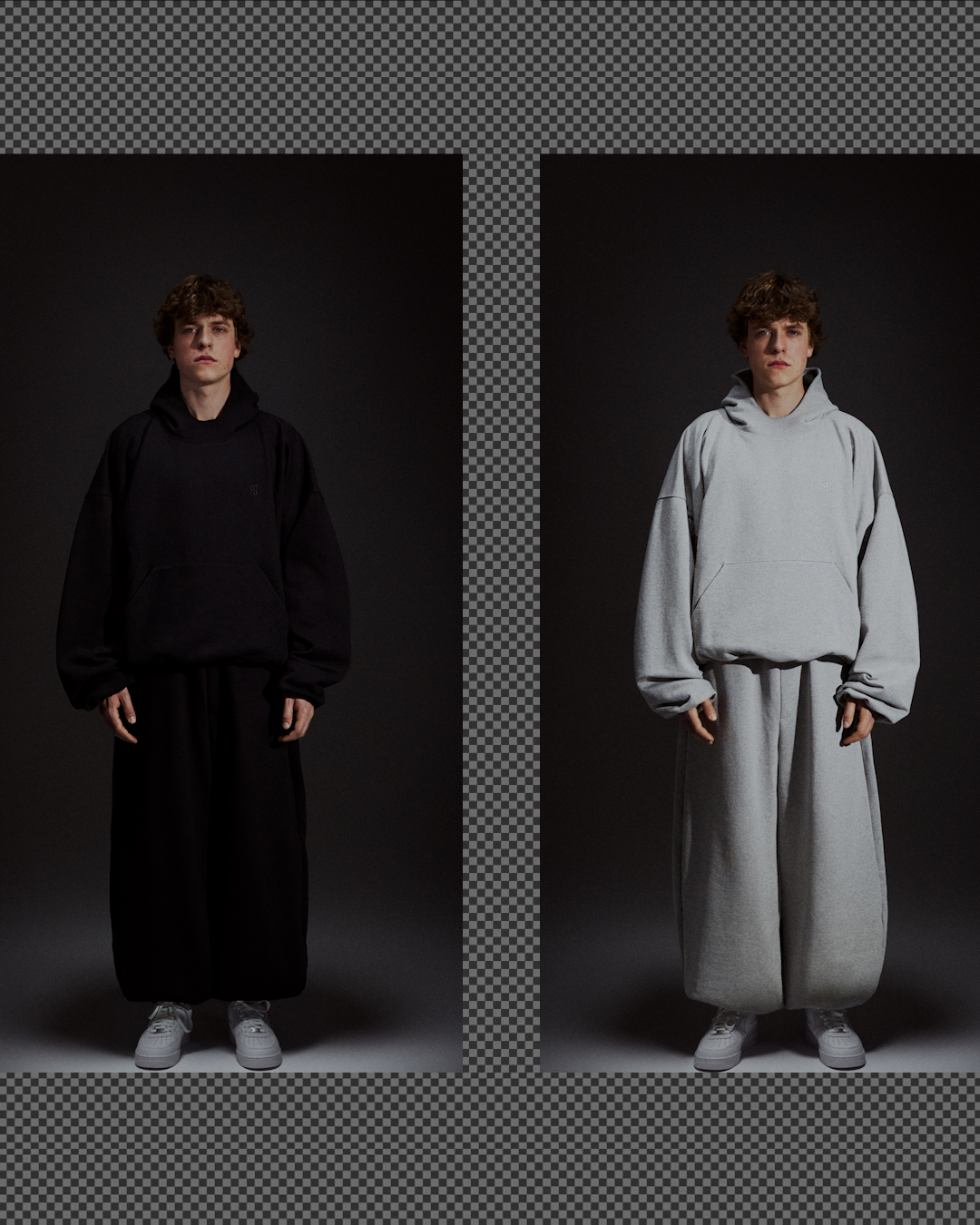
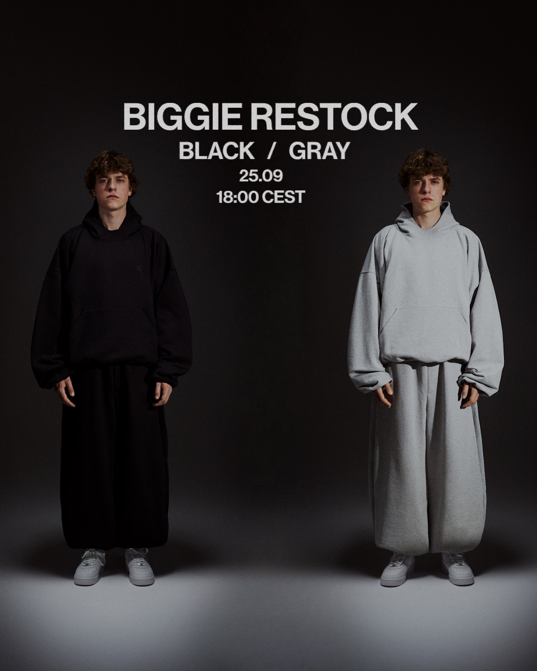
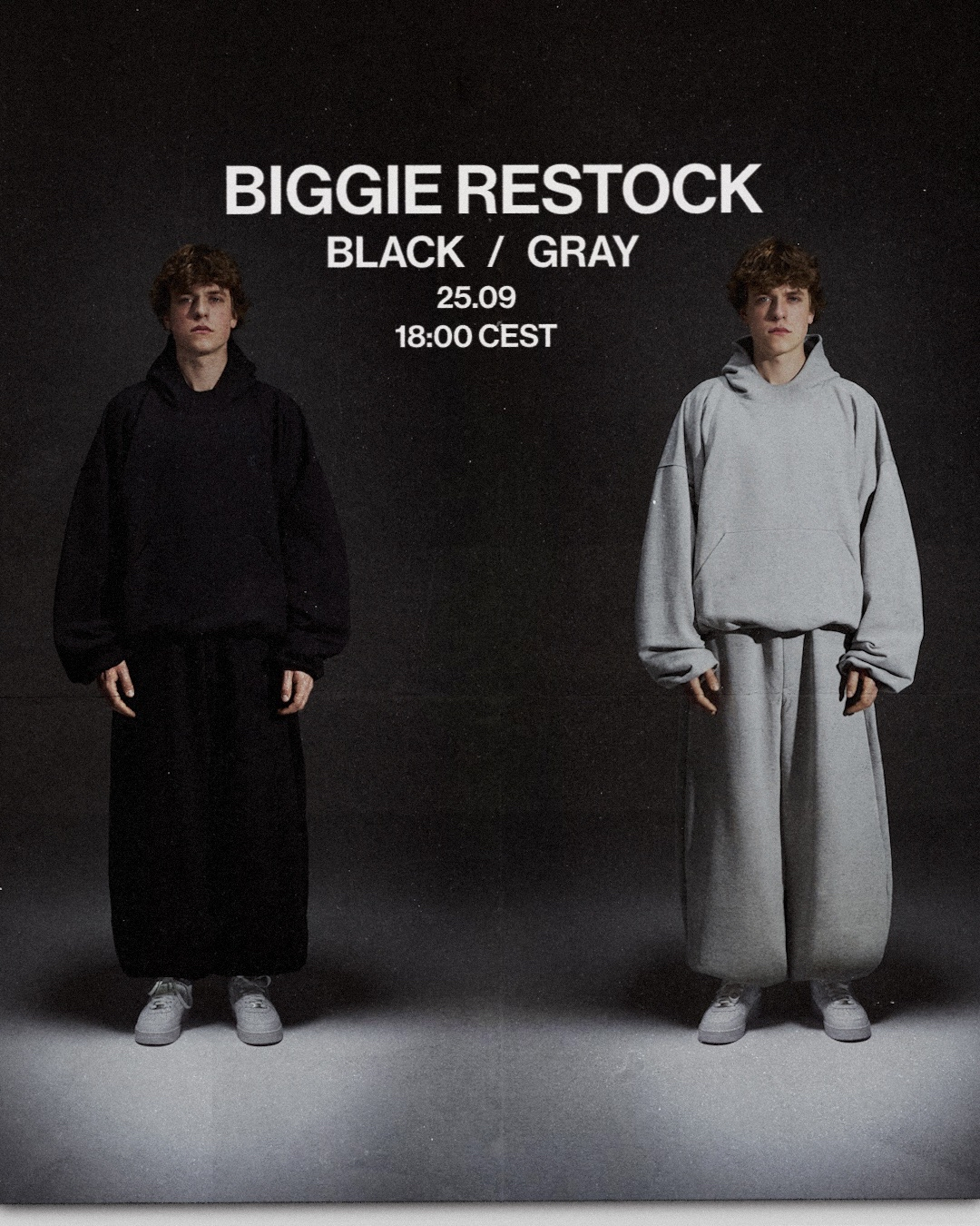
Digital assets created to support product launches, collection debuts, and multi-channel brand communication. The work included social media content, website graphics, visual elements for newsletters, and promotional materials, ensuring consistency across all digital touchpoints.
> COMMUNICATION ADAPTATION
The restock communication also included additional informational materials, designed as separate visual projects. The typography, content hierarchy, and graphic elements were tailored to each specific message while maintaining consistency with RELAB’s visual language. Individual designs were also developed in various format variations, depending on where and how they were published.
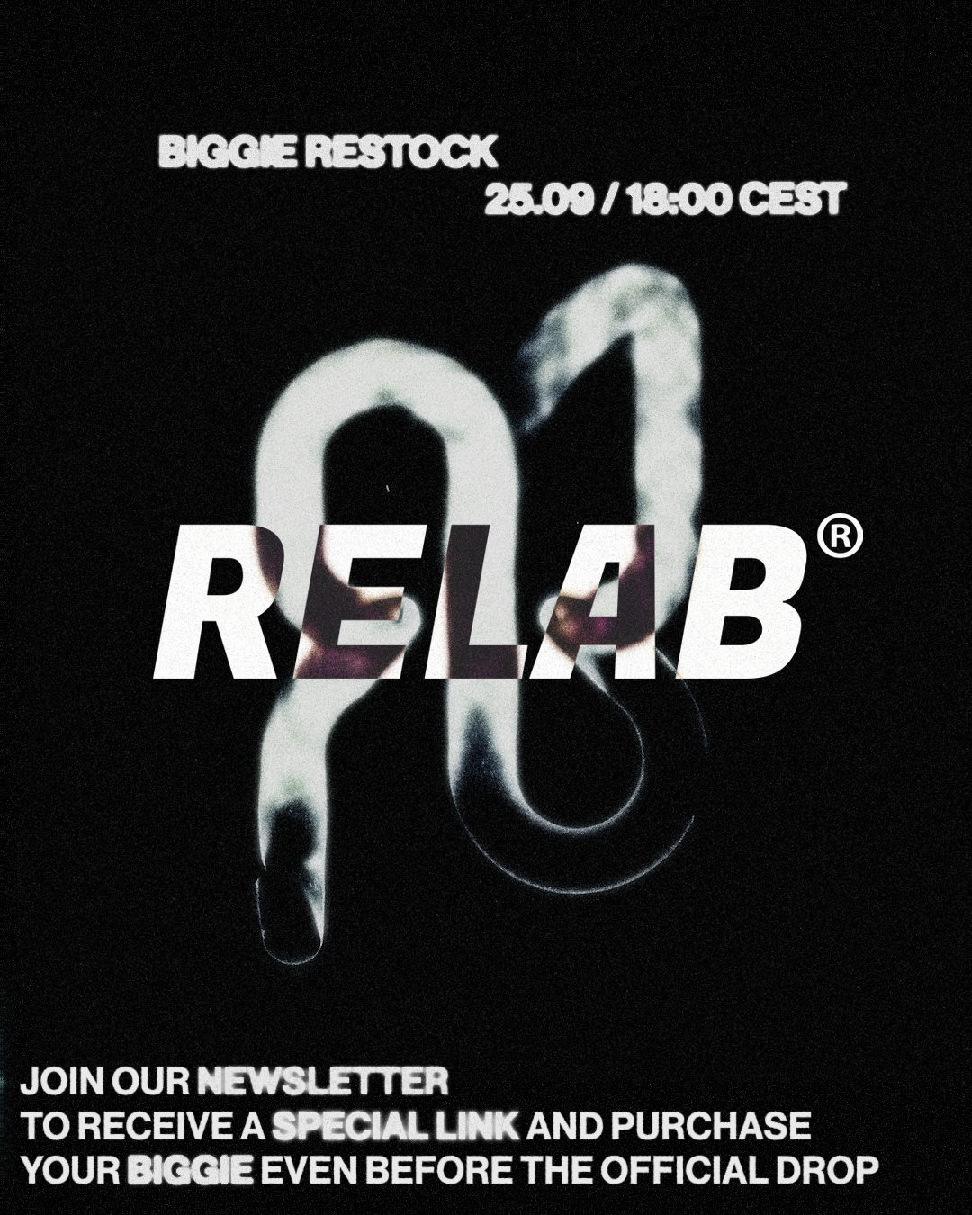
Two versions of the material prepared for the BIGGIE restock campaign. Both designs convey the same set of information, using different graphic solutions while maintaining consistency with RELAB’s visual language.